As a graphic designer, I do have an appreciation for logos with substance, both attractive and compelling. Creating a logo is far from being easy. It takes time and generally requires lots of trials and errors. The design process consists of experimenting [playing] with various ideas and combinations until finding the most effective image.This process can take hours, even days, but the result is so worth it! I’ve collected a few corporate logos that feature a hidden message. Let’s see if you can find them 😉

The arrow is cleverly drawn in the shape of a smile. But that’s not all! It starts under the letter A and ends under the letter Z. Amazon has everything from A to Z!
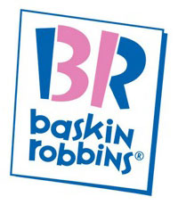
See the number 31 embedded in the “B R” ?? Thirty one-derful flavors !!!
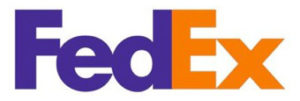
This looks like a very simple logo, but there’s an added layer that makes it one of the most ingenious logos of all time. Do you see the white arrow between the “E” and “x” ??
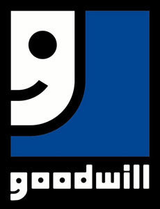
Smiles are good! They convey a positive attitude and happiness all around… always a good idea if you can make it work. For Goodwill, that smiley face is also the letter “g” !!
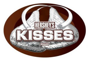
If you’re a chocolate fan, this one is a no-brainer. There is a sideways chocolate kiss between “K” and “I” !!
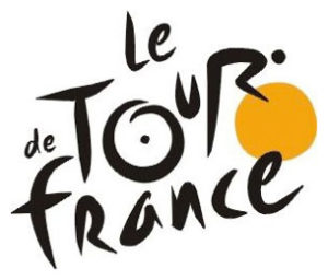
Le Tour de France is the world’s most famous bike race. The “R” in “Tour” is a cyclist, and the yellow circle represents the front wheel of the bicycle.
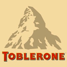
Toblerone chocolate bars originated in Berne, Switzerland, whose symbol is the bear. Look closely at the image of the Matterhorn… can you see the bear ??
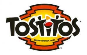
The 2nd and 3rd “t’s” are two people sharing a tortilla over a bowl of salsa.
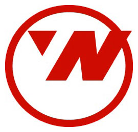
Northwest Airlines. The circle is a compass. Guess which direction the arrow in upper left corner (or beginning of “W”) is pointing ???

This back and white logo isn’t just a tree… look carefully… See the gorilla and the lioness facing each other ??
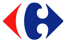
Carrefour is one of the largest hypermarket chains in the world. Its logo is very fashionable and timeless. At first blush, we can see two arrows pointing away from each other. But if you keep looking, you might find the hidden “C” !!
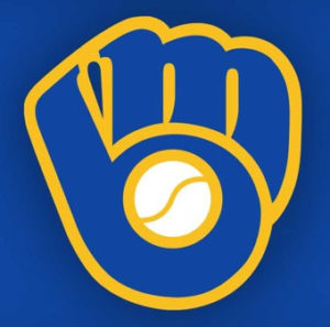
This logo was designed by a college art student. it used to be the emblem for the Milwaukee Brewers. The baseball glove forms an “M” and a “B”.
That’s it. I hope you enjoyed this humble collections of classic logos as much as I did writing about them. I find them very stimulating, and they are always an inspiration for my own creations.